Research
I started with secondary research on attraction reel videos in trade show environments. I quickly discovered that 30 seconds was about the maximum amount of time you could hold a person's attention in this setting, and decided to cap the video at that length.
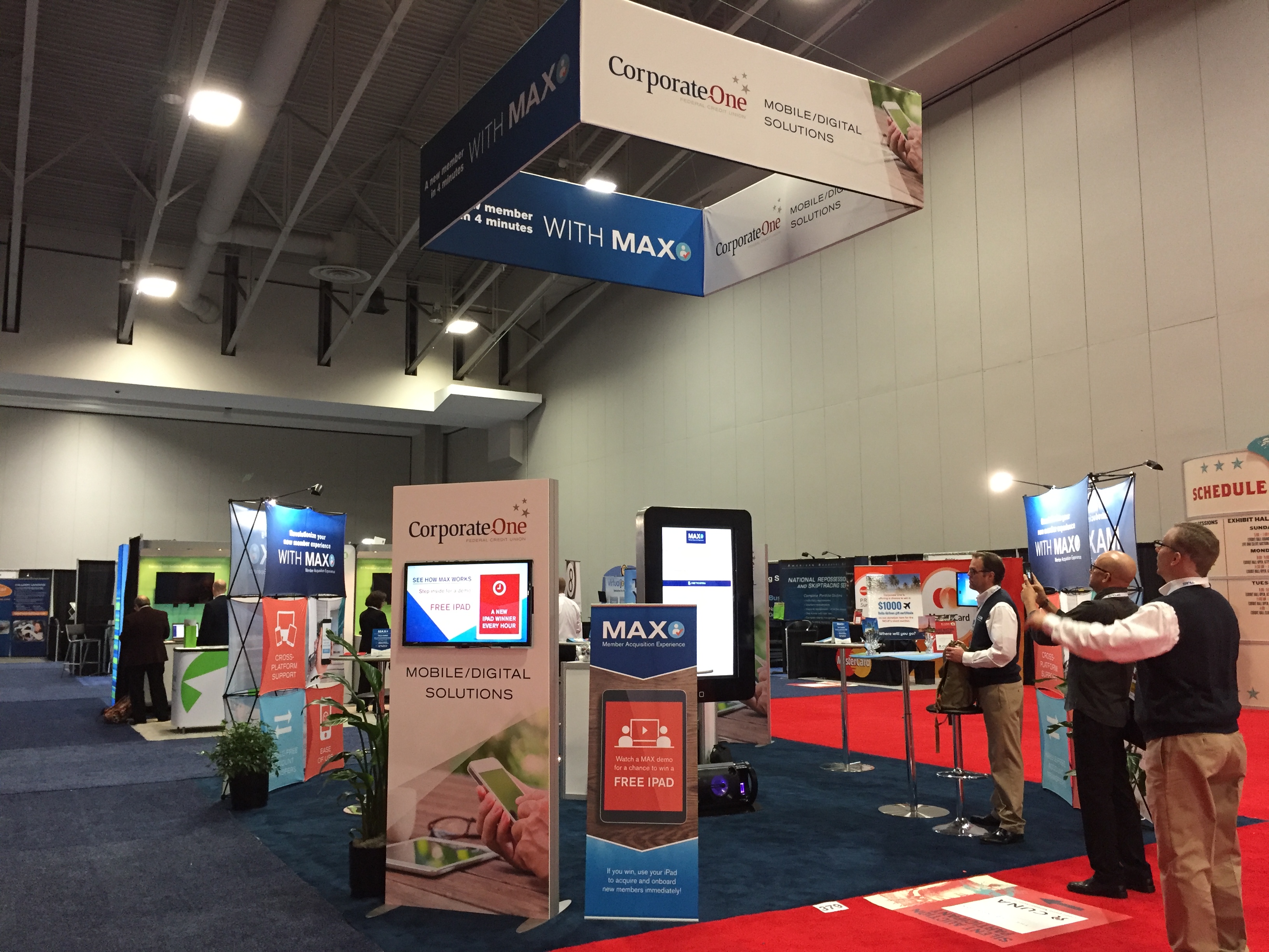
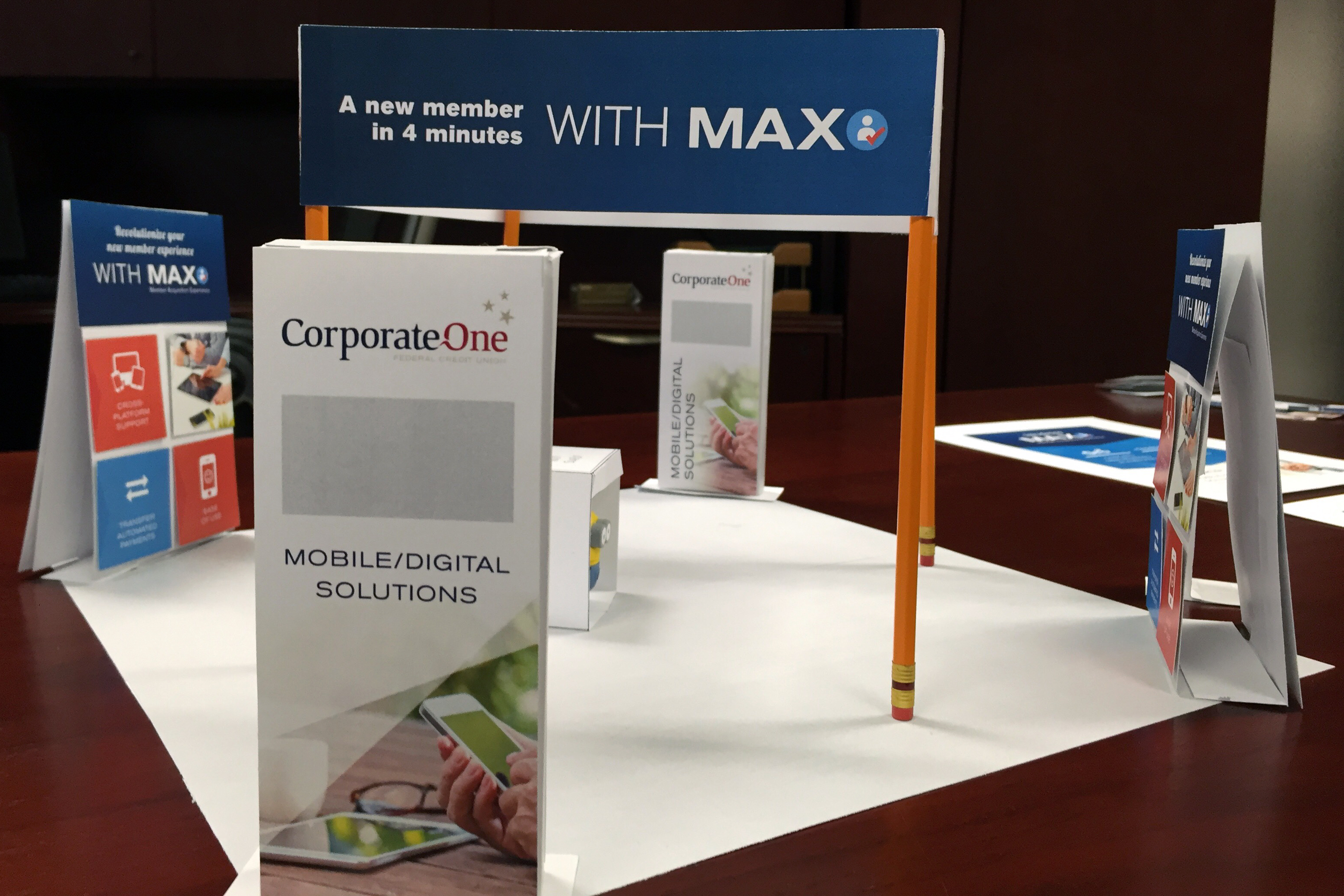
I then looked through all previous photos I had of trade shows that Corporate One attended to better understand the other distractions in the environment, including giveaways, presentations, music and other videos. I also worked with Corporate One's Digital and Communication Lead (who was designing the booth structures shown here) and together we made a scale model of the entire trade show setup to better understand the experience of being inside the booth.
Last, I selected a few pre-built After Effects templates to get the video made quickly, since the next trade show was approaching in a couple of weeks. After pitching these templates along with a quick storyboard, I worked with the AVP, Manager of Communications to select the final template.
Visual Design
Storyboard
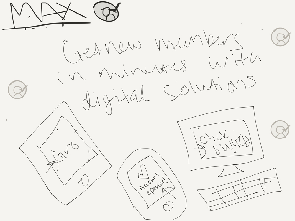
I started by storyboarding all the likely scenes in the video using an iPad app called Paper. Originally, there were 7 scenes including more detailed explanations of the two products within MAX - Gro and ClickSWITCH. After reviewing these with the Manger of Communications, we agreed it seemed like too much for 30 second video.
We then discussed timings and decided that we need about 15 seconds to cover Gro and ClickSWITCH, which would be tight with the 4 scenes I had drafted. We also wanted 10 seconds for the call-to-action at the end that prompts people to come into the booth for the chance to win an iPad. This only left about 5 seconds for any introductory slides.
To stay within 30 seconds, and to keep the focus on more important scenes, we decided to cut the detailed scenes showing how Gro and ClickSWITCH work. Instead, I chose to feature some details about these two products on the device screens within the video. This allowed us to show more content visually, and with fewer scenes.
See the Whole Storyboard ❯
Rough Mockups
Once the storyboard was finalized, I created Photoshop mockups of each scene. I took stills of the motion graphics template video, (roughly) recolored the background elements, and dropped in draft copy and imagery.
I presented this rough mockup to Corporate One management, and it went through a few rounds of revisions. One challenge I faced was the request to add more content in each scene. I explained that since each scene was only up for 2-3 seconds, people wouldn't be able to digest more than a few words and one or two images at a time.
To provide a better sense of the timing, I converted the rough mockup to an animated gif and presented it again. After that, we all agreed that the content needed to be short, sweet and effective.
Draft Video with Music Options
With sign-off on the animated gif, I created polished versions of each scene an Illustrator. I then worked with a contract videographer to drop all the assets into the motion graphics template we purchased.
I worked with the videographer to select music for the video. We chose upbeat, mostly instrumental tracks with a strong drum line to grab people's attention and draw them towards the booth. I pitched three music track options, including two with subtle human voices and whistling. I chose the singing and whistling options to bring warmth to the video, grab people's attention quicker and carry better in a busy convention setting. Ultimately, Corporate One's management preferred the third option, which was purely instrumental.
User Testing
To make sure the video met Corporate One's goals, and to ensure the content was understandable and engaging, I ran user testing sessions with 6 people. I recruited participants from internal staff, and made sure to select people with little or no prior knowledge of MAX. I also selected several staff with direct, daily contact with credit union CEOs and board members, who were the actual target audience.
Each session lasted about 15 minutes, and included:
- Introduction
- Setting the scene
- Pre-video expectations gathering
- Watching the 30-second video (without music since it wasn't yet finalized)
- Post-video qualitative questions
- Post-video quantitative survey
See the Test Script ❯
After testing was complete, I summarized all my findings into a brief report for management. Overall, the video was very successful in achieving Corporate One's goals. However, there were a few areas where participants seemed confused or offered other feedback. I proposed a few changes to the video, including:
- Demonstrating that MAX works on desktops and in branches. While the idea of mobile account opening was appeal to some participants
- Simplifying language and removing any unnecessary animations. Most participants seemed overwhelmed during scenes 2 and 3 in particular.
- Showing an obvious tie in to "my credit union." Participants understood that opening accounts would be faster, but didn't understand how these solutions would integrate with their credit union. They assumed MAX only applied to millennials opening accounts from home or on-the-go.
- Making the in-booth demo clearer in the final scene. Most participants wanted more information about MAX, but weren't sure if they would learn any more by stepping inside. They were also excited about the iPad giveaway, but didn't understand that they would see a demo prior to entering to win one.
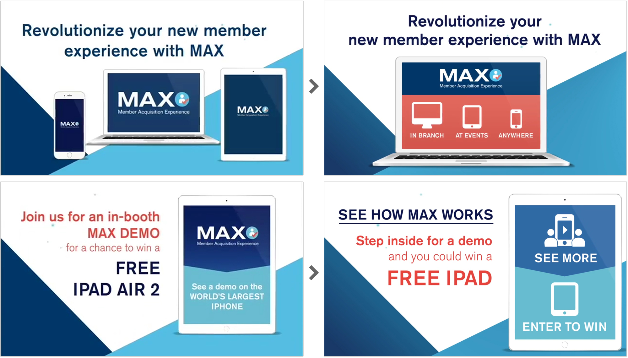
To correct these issues, I made a few copy and design changes to the video. Scenes 2 and 6 had the most changes, as you can see below.
Conclusion
The MAX video helped to draw in traffic to the booth, and also helped prime visitors with some knowledge of MAX and the iPad giveaway. This trade show was one of the most successful in Corporate One's history.