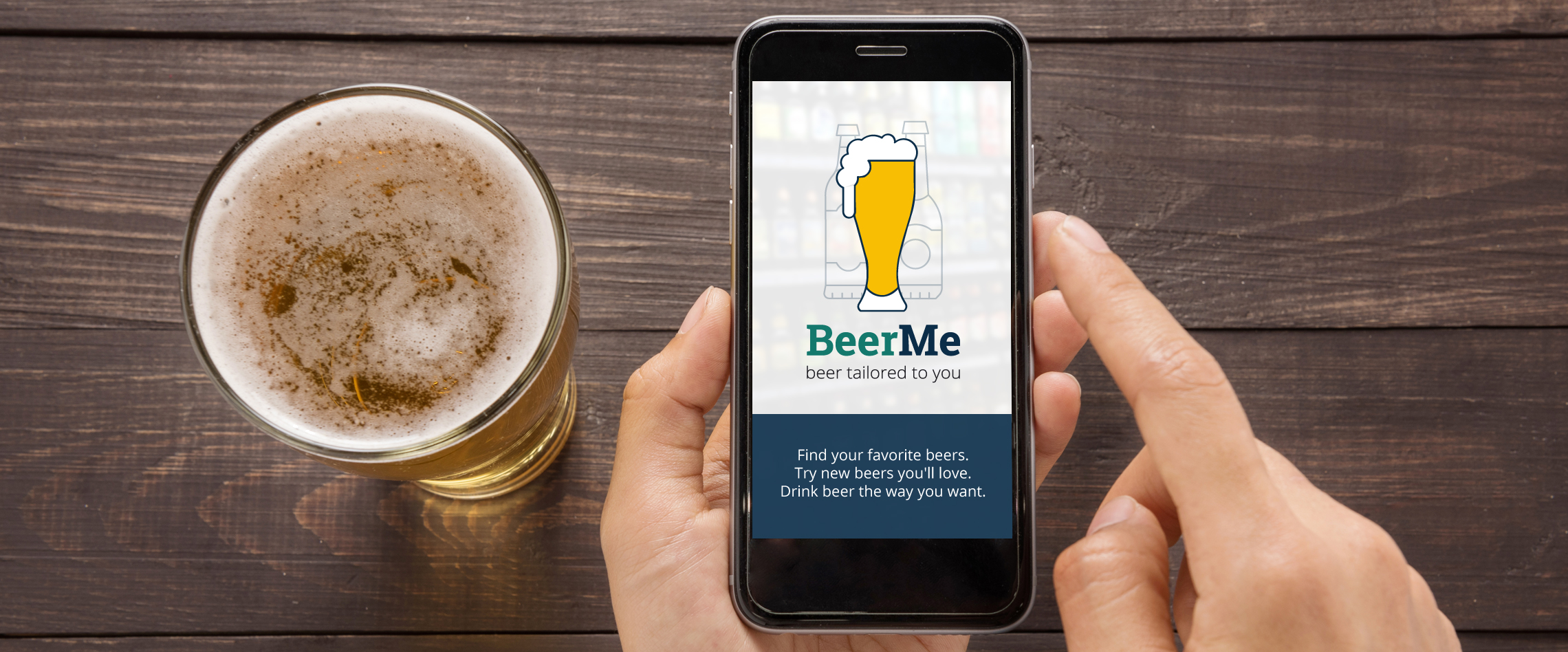
Concept
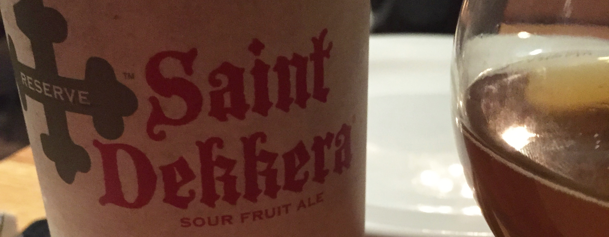
One night I was eating dinner at Pies & Pints. Thanks to their uniquely organized menu, I discovered my new favorite beer - Saint Dekkera Poire. But when I tried to buy it again, I realized how hard it is to locate and purchase rare craft beers.
A week later I found myself back at Pies & Pints bar, ordering their remaining 5 bottles. I struck up a conversation with the man next to me about his favorite beers and how he first heard about them. This experience made me wonder - how do people discover new beers? And better yet, how can people discover, locate and drink new beers that they'll really love?
See the Full Concept Proposal ❯
User Research
Interviews and Photoethnography
I interviewed 6 self-identified craft beer drinkers to learn how they currently buy and drink beer, and discover any pain points that a mobile app could help solve. Interviews were conducted in-person and over the phone, lasting approximately 1 hour.
Notable findings:
- Trying new beer is a hobby. Most of the time the new beer is just OK - neither great or awful. The fun comes from trying something new, and usually picking a beer with a fun label or cool name.
- Experienced beer drinkers have strong opinions about the styles and brewers they like and dislike. They rarely purchase outside of this safety zone.
- Everyone has purchased 6-packs and been disappointed in the taste. The remaining 5 beers usually sit in pantry until they can be donated at a party.
- Beer experts have a hard time finding their favorites. They often drive long distances to get them, or reach out to brewers directly hoping to find stock and availability. For seasonal or limited-release beers, this hunt is even harder.
- Beer recommendations suck. Everyone has different taste and preferences, and recommendations rarely take this into account.
- Most people don't currently use a beer app. They haven't seen the need, and instead try to remember the beers they like and dislike, or just buy within a comfort zone.
- Beer selections are overwhelming. Most people tackle large selections by eliminating styles they don't like first, then looking for styles and brewers they like and trying to find a new beer within that safety zone.
Questionnaires with Kano Analysis
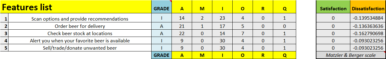
44 participants completed an online questionnaire about their beer preferences and habits, demographics and beer app usage. Five potential BeerMe features were tested using a Kano analysis to determine what would delight users, which are expected, and which features users they feel indifferently towards.
Notable findings:
- For those beer drinkers that use a mobile app, Untappd was by far the most used (72%), followed by BeerMenus (16%).
- The most common reasons to use a beer mobile app were to save favorite beers(17 votes), see beer reviews (11 votes), and to discover and try new beers (10 votes).
- From the Kano analysis, two features that could differentiate BeerMe from competitors are stock/availability and ordering beer for delivery. However, in interviews users were skeptical of beer delivery services, often having negative experiences with "beer of the month" clubs that limit choices and charge a premium for deliver.
Kano Analysis:
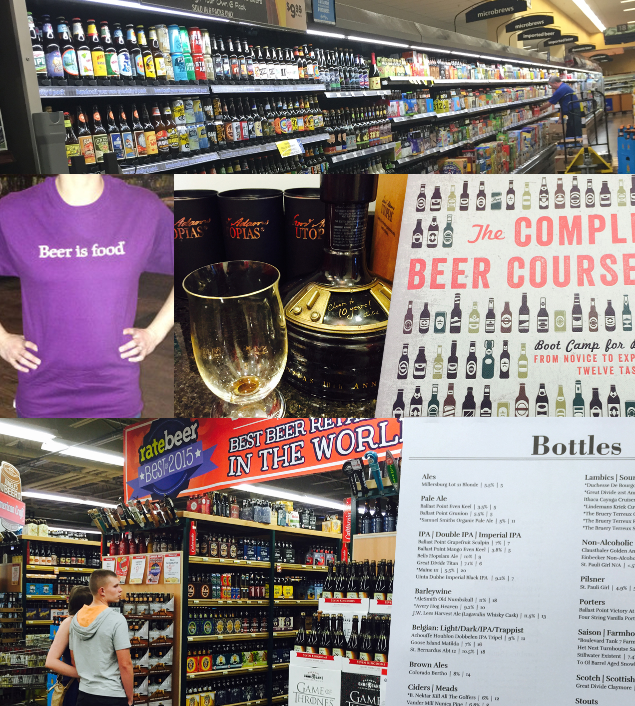
Competitive Analysis
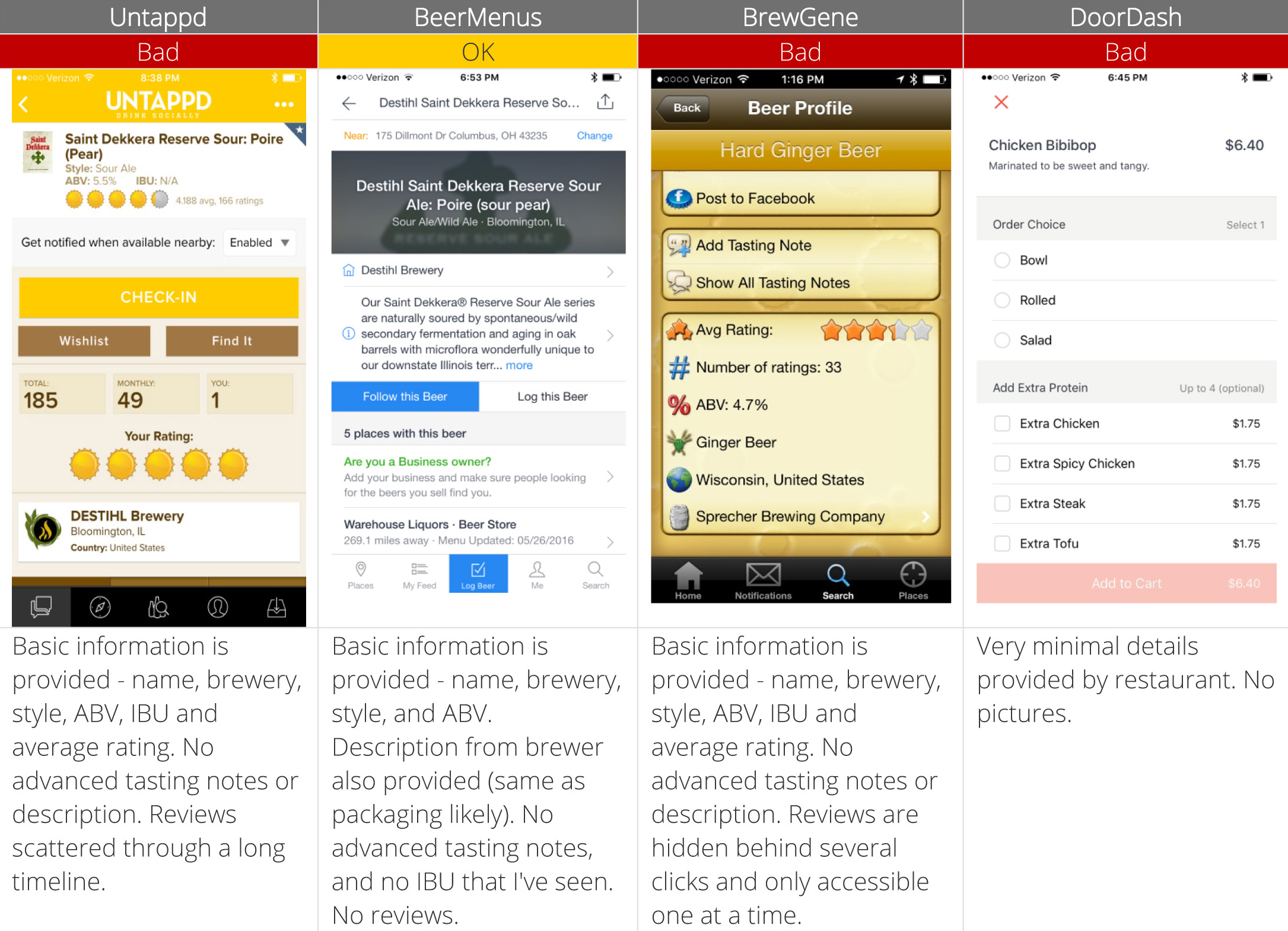
Four competitor mobile apps were reviewed against user needs and usability heuristics. These apps included Untapped, BeerMenus, BrewGene and DoorDash (for delivery purposes).
Notable findings:
- BeerMenus handled "my beer list" the best with a simple design and easy access from the main navigation. They also use phrases (must-try, no thanks) along with a simple 5 star rating, making it easier to remember what 4 stars really means.
- Discovery and suggestions are sub-par in all competitor apps. No apps provide personally tailored suggestions, and searching, sorting and filtering are limited.
- Beer details are sparse and usually don't provide any more information than you could read on a beer's label.
- Stock and availability are usually crowdsourced if they're provided at all. The one exception is BeerMenus, which has accurate listings and costs provided by stores, not users.
- Delivery is rarely offered, at least in the Midwest. Some other apps including Saucey offer beer delivery in other parts of the country.
- Most apps did a poor job incorporating usability heuristics, particularly consistency and error prevention.
Read the Complete User Research Plan ❯
Empathy Maps & Personas
Two clear, goal-based user patterns emerged from the interviews and questionnaires.
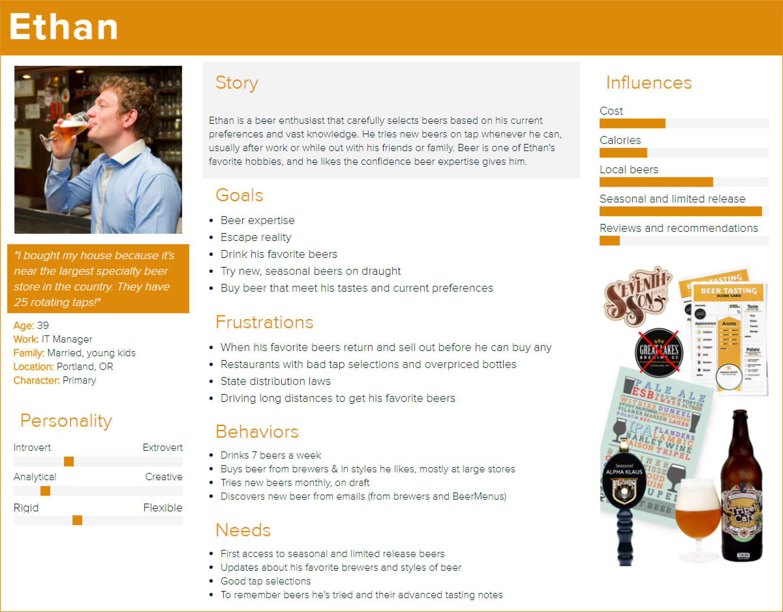
First is the primary persona: the beer expert who views beer as a destination. For them, beer is a serious hobby where they invest time to discover their favorites through a careful evaluation process. They tend to have a lot of beer and brewing knowledge, and they select beer based on what they know they like.
The secondary persona is a more casual beer drinker who views beer as part of another journey. For them, beer is a fun enhancement to a party, dinner or date. They tend to have less beer knowledge and choose beers based on convenience or fun names and labels.
Primary persona:
 View Complete Empathy Maps and Personas ❯
User Stories and MVP
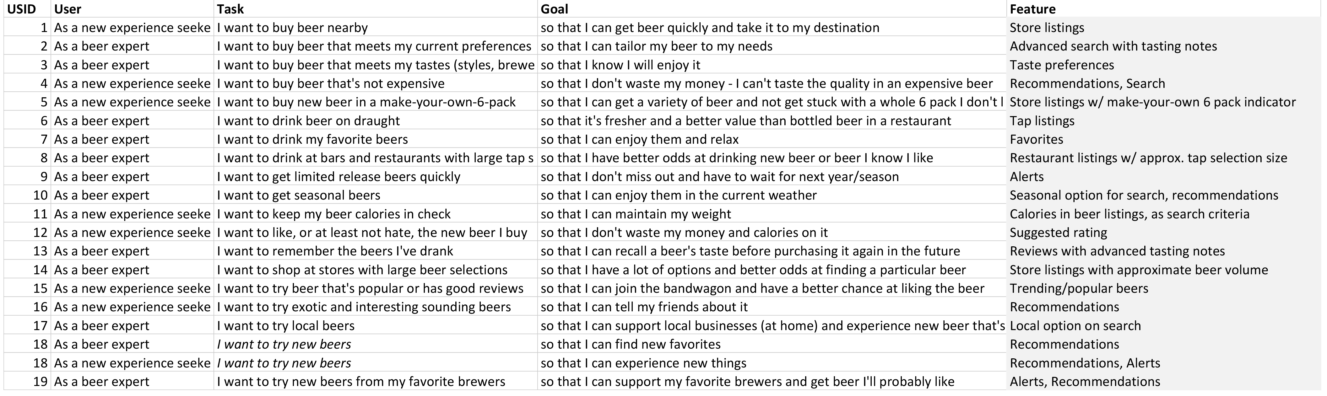
To keep wireframes and visual design focused on user needs, 19 user stories were created from interview findings. Each user story was then tied to a feature to build a Minimal Viable Product (MVP). For BeerMe, this MVP is a set of wireframes with key features included for usability testing.
MVP Features:
- Favorites
- Recommendations
- Search and Filter
- Alerts
- Store and Restaurant Beer Listings
 See Complete User Stories and MVP Features ❯
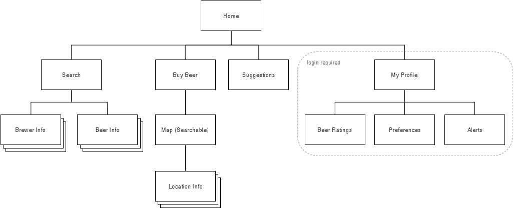
Card Sort and Sitemap
To understand how craft beer drinkers organize and label beer-related tasks, I asked 9 participants to complete an unmoderated, open card sort. They sorted 28 cards into groups of their choosing, and labeled each one.
After standardizing the results, there were three clear groups that all participants agreed upon:
- My profile/preferences
- Beer info
- Suggestions
Several remaining categories overlapped to create these groups, but with some variation in their cards:
- Locations/map
- Lookup/find
From these results, I created the following sitemap for BeerMe:
 See the Card Sort and Sitemap Report ❯
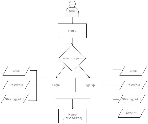
User Flows
Six user flows were created to understand the steps users will take to accomplish their goals within BeerMe. The final user flows were also used during wireframe creation.
The common user goals and tasks used for these user flows are:
- Login or sign up
- Setup profile
- Look up beer
- Rate beer
- Find a seasonal beer on tap nearby
- Try a new beer in my favorite styles or from my favorite brewers, within 30 miles
While drafting user flows, I made most features of BeerMe available without logging in. I made this decision during competitor analysis, where I was often frustrated by early sign up screens. In some cases, I signed up for apps only to later find they weren't even available in my area (I'm looking at you, Saucey).
I then used log in only when necessary, like for My Profile and beer ratings. I also ensured that login offered value-added features and accelerators for users, like quicker look ups and ratings.
See All User Flows ❯
Wireframes and Clickable Prototype
I created 39 wireframes to outline all the content for major screen in BeerMe. I started with low-fidelity sketches and worked up to high-fidelity wireframes built in Balsamiq.
I then linked all these wireframes together in a clickable prototype using InVision. This prototype was presented on a mobile phone to users for usability testing.
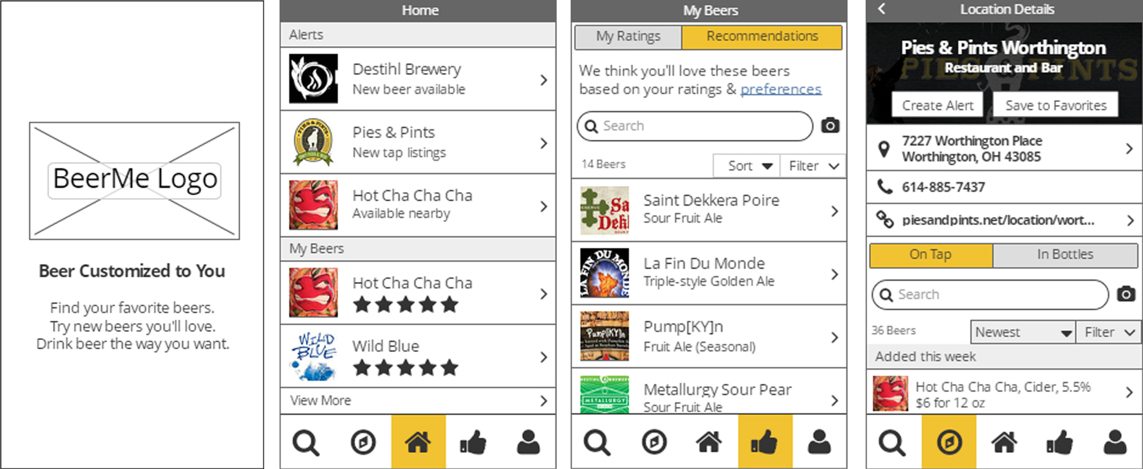 Try the Clickable Prototype ❯
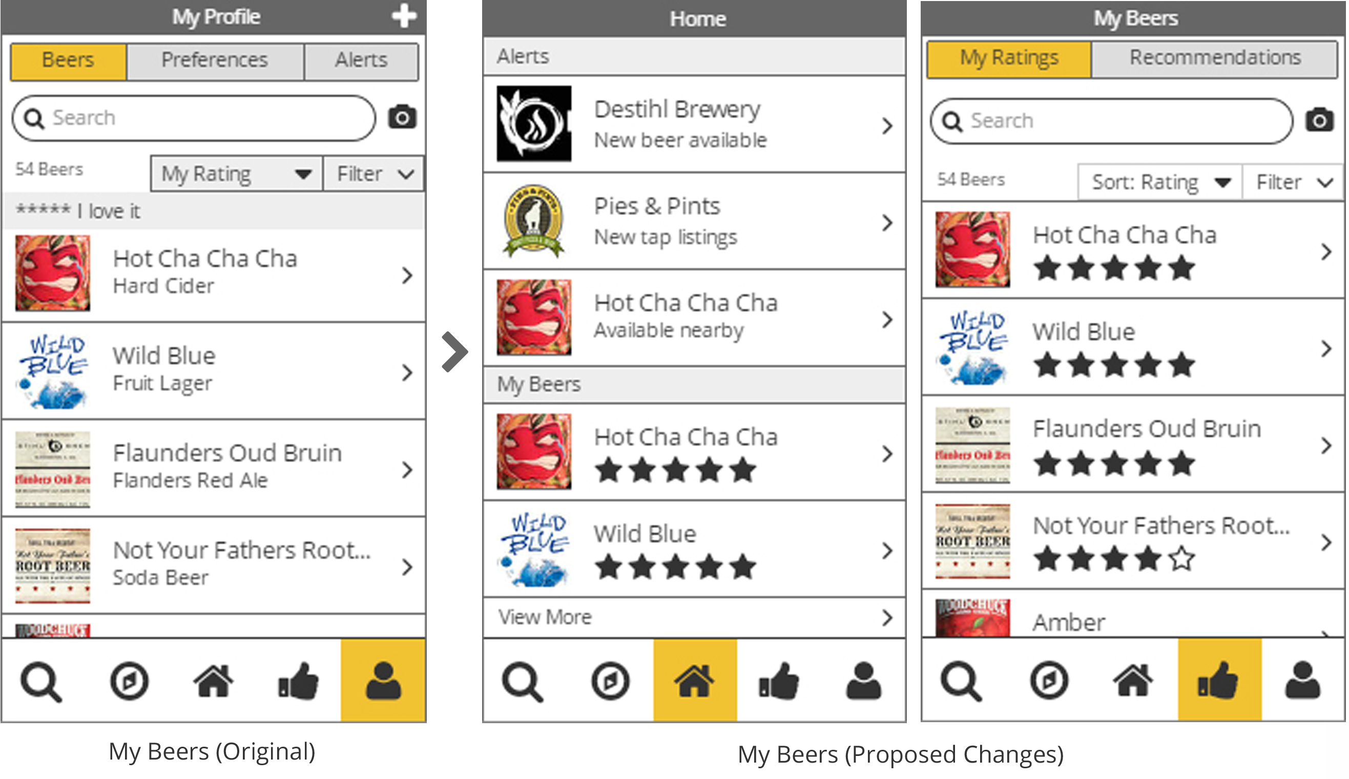
Usability Testing
To test the wireframes, I asked 5 craft beer drinkers to try out BeerMe's clickable prototype. I asked for their initial impressions, let them explore the app freely for a few minutes, and then had them perform specific tasks.
Overall, participants were excited about BeerMe and found it easy to use. Several actually asked when it would be available in the app store for them to use. All users were excited to see tap listings at restaurants, either to replace poorly designed bar menus or to plan ahead what they would drink before arriving.
A few key areas of BeerMe were confusing to users:
- My Beers was difficult to find under My Profile. Users often went to the "thumbs up" icon thinking it was beers they had liked, instead of Recommendations.
- Users often wondered if they were alone in the app, or if other users were providing the recommendations.
To correct these issues, I moved My Beers under the "thumbs up" icon in the navigation to make it more accessible and to match users mental models. I then incorporated Recommendations on a secondary tab, hoping to more clearly tie it with your personal ratings. I also added text to the Recommendations screen about how they're calculated.
 See Complete Usability Testing Report ❯
Style Guide
To prepare for a polished visual design and logo, I created a one-page style guide. This includes a color palette, typography and button styles.
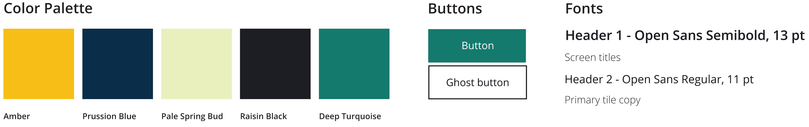 See the Style Guide ❯
Logo Design
I designed the BeerMe logo to quickly communicate key features that make BeerMe different from other beer apps.
BeerMe differentiators:
- Personalized beer experiences
- Recommendations tailored to you
- Confidently choose a beer you'll love from many options
This logo slowly evolved over a few months as I conducted research and testing. Originally, it started as a beer handed over on a silver platter, like a beer concierge. However, during research it became clear that people love to pick their own beers, with more of a subtle nudge in the right direction.
A big shout out to my fellow designers Tom Rauscher and Melissa Phillips for helping me brainstorm final logo ideas! We sketched about three dozen options over lunch, including some really off-the-wall ideas.
What's Next?
Clickable Prototype v2
I'll incorporate the feedback from usability testing into another clickable prototype. I'll rebuild each wireframe in higher quality using InDesign before putting them back into InVision.
Visual Design
I'll apply the colors, typography and buttons from the style guide to the new clickable prototype. I envision the style guide will also evolve along with the new prototype, as more neutral colors may need to be added.
Usability Testing - Round 2
I'll test My Beers and Recommendations again to ensure that issues from the first round of usability testing have been corrected.
Licensing
Since so many testers want to use the app, and many others have asked if I'll build and sell it, I'm considering licensing BeerMe. While I thoroughly enjoy working on BeerMe, my passion is in user experience, not in building a database or running a mobile app business.
If you're interested in licensing BeerMe, reach out to me at info@staceylaugel.com.